Graphic Design | Photography | Motion Graphics | Social Media | Illustration
DESIGN FOR PRINT
PHOTOGRAPHY
DESIGN FOR PRINT
DESIGN FOR PRINT
Design For Print
Photography
Illustration
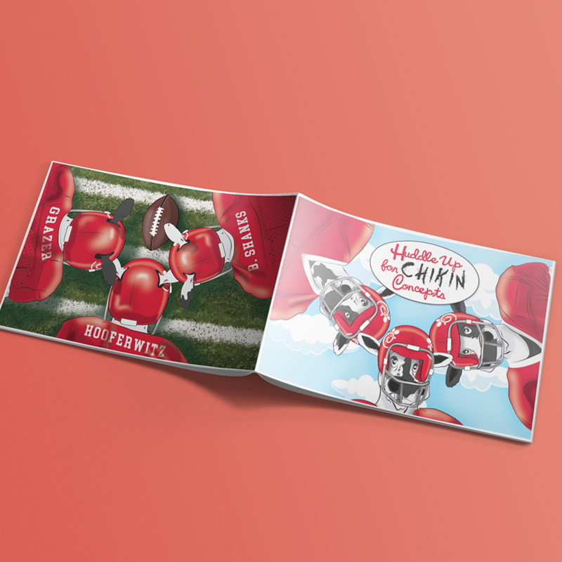
Project brief: The QSR customer was looking for new chicken sandwich ideas to feature on their menu. Our chefs came up with menu ideas for the creative team to photograph.
My role: We knew that the customer was a college football fan and our sales rep asked if we could somehow incorporate football into our design. It was the art director’s idea to place their cow mascots in football uniforms to use on the cover. I drew both images for the front and back covers, assisted with photography and editing, and laid out the design of the book.
Thoughts: Getting to know your customer well enough to incorporate personal touches was… well… a nice touch! The customer loved it and it was fun to execute.
Motion Graphics
Design For Web
Social Media
Project brief: The interviewer was looking for the applicant to create a social media and email campaign for a Memorial Day sale using the company’s current design aesthetic.
My role: I researched the company by visiting their website as well as social media pages (Facebook, Instagram, and Twitter [X].) They provided past email campaigns as part of the interview process. I created a cohesive social media and email campaign using some provided images, as well as finding my own off some of their past posts.
Thoughts: Well, I didn’t get the job but still enjoyed working on this project. I believe there is always an opportunity to learn from our experiences and perhaps I could have asked more questions to pinpoint exactly what they wanted. Despite the outcome, I feel it was a successful attempt at creating something cohesive and simple yet eye-catching and kept within the company aesthetic.
Design For Print
Photography
Design For Print
Photography
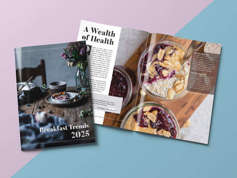
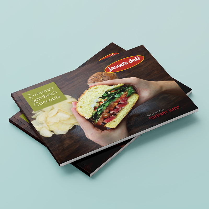
Project brief: The QSR customer was looking for new and “summery” sandwich ideas to feature on their menu. Our chefs came up with menu ideas for the creative team to photograph.
My role: I was responsible for photography set up (lights and composition,) deciding to go with an outdoor picnic type look with the photos to drive home the “summer” feel, which included shooting on a wood foreground and using napkins and chips as props. Another artist and I edited the photos together, using Photoshop to add in the outdoor backgrounds afterward. I put together the book using the company’s existing aesthetic as guidelines for the visual elements used.
Thoughts: I really enjoyed shooting the photography for this book. I understand the importance of a solid, one-color background sometimes but photographing while using props doesn’t have to distract from the subject when it is done correctly. It adds visual interest and tells a story, which makes a photo far more memorable, in my opinion.
Design For Print
Photography
Illustration
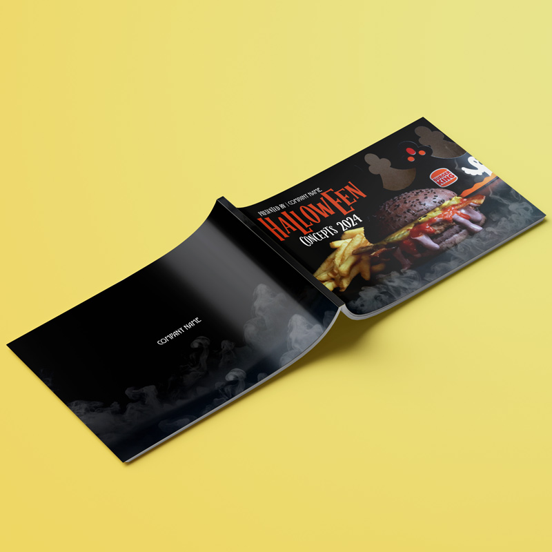
Project brief: The QSR customer was looking for new burger ideas to feature on their menu as a Halloween LTO (limited time offering.) Our chefs came up with menu ideas for the creative team to photograph.
My role: The creative team had a brainstorming session on potential props to incorporate into the foreground with these builds as well as what to include in the backgrounds that got Photoshopped in afterward. I handled photo setup and prop utilization, and one of the other artists and I did post editing together. I created all the customized illustrations in the book on the title pages.
Thoughts: Time doesn’t always allow for a lot of forethought on a project but, I believe when it does, it shows! We had the ability to really conceive these ideas beforehand as well as create custom drawings on each page spread. Another fine example of personal touches really creating something special.
Design For Print
Photography
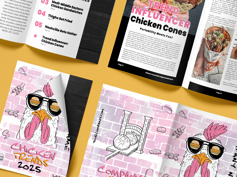
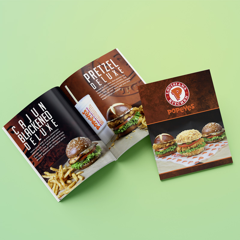
Project brief: The QSR customer was looking for new chicken sandwich ideas to feature on their menu using mostly items from their current pantry list. Our chefs came up with menu ideas for the creative team to photograph.
My role: I was responsible for photography and set up (lights and composition.) I created 2 custom backgrounds with company logos and used them as backdrops for the photos. The photos were then edited and added to a presentation where the design layout matched the company’s brand aesthetic.
Thoughts: We played with lighting a little bit during this photo shoot; drastically reducing the brightness of the fill light. It made for an interesting change by adding some depth to the sandwiches. Not everything has to be evenly lit; just like the fries didn’t need to be in a neat little pile and the breading crumbs didn’t need to be wiped away before the photo was taken. Real life is naturally messy and a photo that is too staged can look disingenuous.

Motion Graphics
Photography
Design For Web
Social Media
Project brief: These are different social media posts featuring builds created by our chefs using our bread products. I used already existing images in our database and turned them into animations using Adobe After Effects. All animations on this page are entirely my work (as are all other projects shown on my website unless otherwise noted,) and not the work of others on my team.
Design For Print
Photography
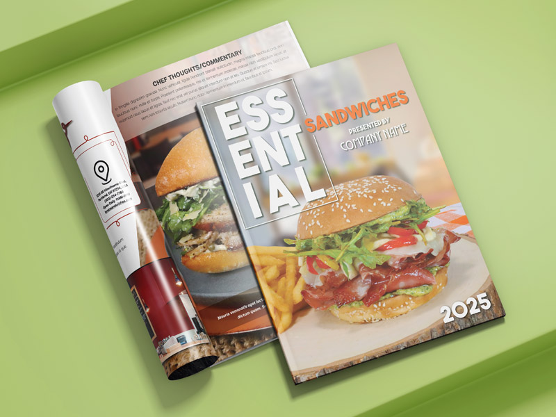
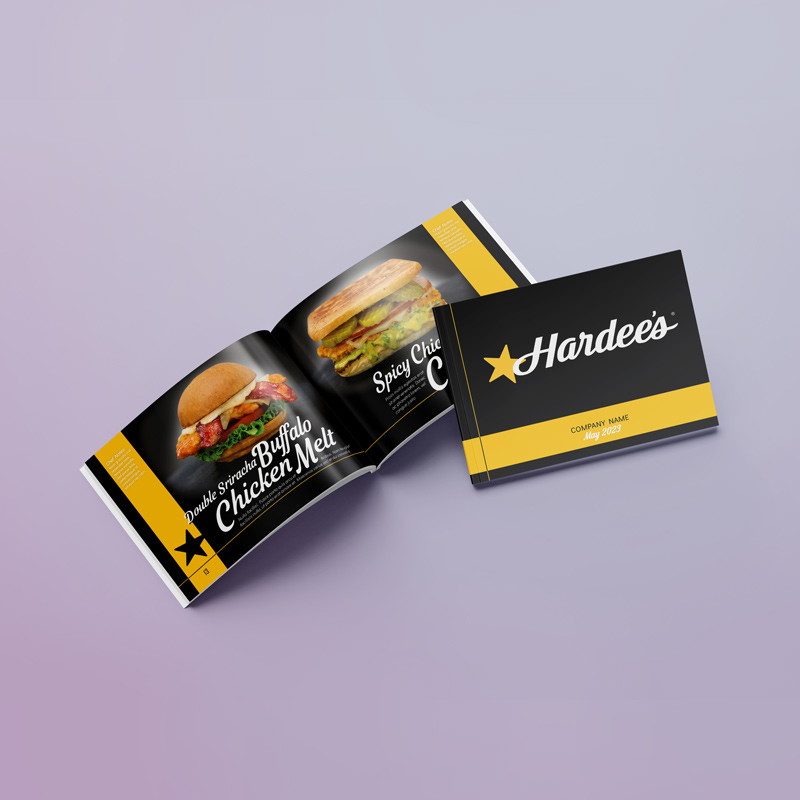
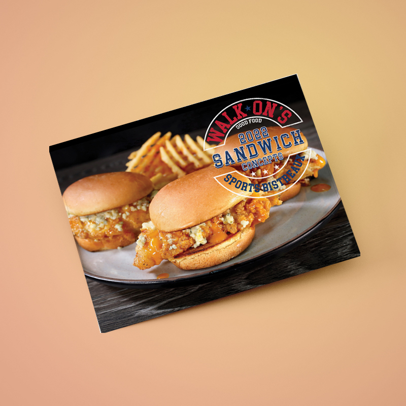
Project brief: The QSR customer was looking for new sandwich ideas to feature on their menu. Our chefs came up with menu ideas for the creative team to photograph.
My role: Another member of the creative team oversaw the photography in this book. I created the layout of the book as well as the graphic design elements—the title artworks on each page spread. As this customer has a “collegiate” kind of feel with their logo, I thought it would be a nice added touch to do the same for the titles.
Thoughts: This is another book where I was able to create a bit of customization and personal touches. I also included an image of the very first sketch that was ever conceived of the restaurant’s layout; though, unfortunately, I couldn’t find a high-quality version of it, so I had to redraw it in Illustrator to include it in the book. I know a lot of graphic design jobs are very template-based where it’s “quantity over quality” and there’s not a lot of personalization within projects, but the beauty of my job is it’s generally the exact opposite!
Photography
12 Years of Professional Experience in the design industry
I am currently a Sr. Multimedia Designer in the Marketing Department at Highland Baking Company. I create marketing documents, such as: posters, POS (Point of Sale) brochures, booklets, advertisements, and social media posts, all while sticking to each individual customers’ brand aesthetic and guidelines.
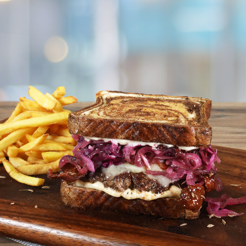
The art team and chefs (known collaboratively as the Culinary/Creative Team) create presentation books for customers, showcasing menu ideas featuring their proteins on our bread. My role includes photography, composition, food styling, and photo editing, along with book and menu design for both print and digital distribution. When we come together as a team and spread our wings (creatively-speaking,) it’s when we really shine! Also, my continued passion for nutritious food and living healthy recently led me to become NESTA-certified in Fitness Nutrition.